Fastly
Brand Guidelines
Version 2.0, 2025
Performance Patterns
Motion coming soon
Presentations coming soon
Swag coming soon
Fastly Brand Resource Center
Our brand governance and design guide
How to use this site
A unified and consistent brand voice helps our team members, partners, and customers clearly understand who we are, what we do, and why we exist.
Use these guidelines as a reference to inform and shape any experience and messaging materials you create at Fastly, from marketing campaigns to product design and everything in between.
About Fastly
Our company
Fastly is a programmable edge cloud platform that helps developers create secure, scalable and fast digital experiences.
Our mission
Making the internet a better place where all experiences are fast, safe, and engaging.
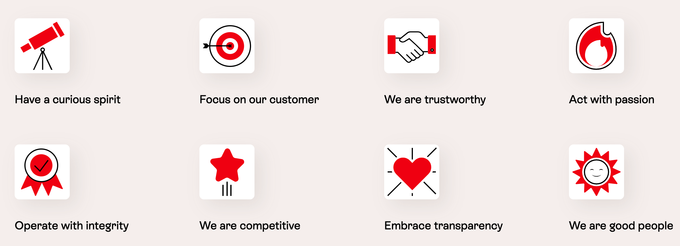
The values that guide us
Our Logo

The Fastly logo differentiates us from an ocean of brands. We use a distinctive red, and enjoy the flexibility to use the Fastly tachometer where appropriate. This signature icon embodies the speed and forward movement we bring not only to customers, but also to the industry as a whole.
Our logomark

Aside from our logo, we also use our logomark. It's a simplified version of the tachometer "a" that's found within our logo.
Logo and logomark usage
Color
Our logos may be used in White, Black, and Platform Red.
When deciding which color to use for our logo, use your best judgment to determine maximum contrast and legibility. Never use any of our secondary colors in the logo.


Clear space and minimum size
To ensure prominence and legibility, the Fastly logo and logomark should always be surrounded by an area of clear space that remains free of any other graphic elements. In order to maintain maximum clarity at all times, the logo and symbol should not be reproduced below the minimum size indicated for both print and digital (on-screen) uses.

Paired logo lockup
Sometimes, the Fastly logo may need to be paired with another logo to demonstrate a partnership or customer relationship. When combining the Fastly logo with another, we use a black plus sign to connect them. The height of the plus sign should match that of the Fastly "s", and there should be a gap the width of the Fastly "f" between the logos and the plus sign. Both logos should carry equal visual emphasis.
Vertical system (partner lead)
Logo misuse
Our logo is our most important asset and should be treated with the utmost care. Review the following examples of misuse to avoid using our logo outside of our brand guidelines. Note that the same rules apply for our brand symbol.
Logomark misuse
The logomark can not be manipulated for new external or internal branding purposes.

Social avatars
We use our logomark for our social media profile pictures. Keep the social media profile picture set in the primary brand colors.
Favicons
We use a simplified version of our logomark for browser favicons. The favicon omits the tachometer's center details, so it is as clear as possible in smaller sizes.
Our default favicon is displayed in Platform Red and should be used across all domains unless otherwise specified. Certain domains apply custom colors to the favicon to help with tab identification. These domains include docs.fastly.com, developer.fastly.com, and support.fastly.com. All other subdomains should use our default favicon.

Colors
Primary Colors
Rainbow
Monochromatic Rainbow
Colored Backgrounds with Logo
Colored Backgrounds with Type
Chameleon Principle Color System
Misuse
Colors
Color is an essential part of our brand expression; it's how we differentiate ourselves from our competitors. Our palette is designed to elevate our brand and express our unique personality.
Red is our leading color. It's bold, commanding, and energetic — exemplifying the speed at which we operate. It should be the leading color in all of our big brand moments and present in all designs and communications.
Primary palette
Our primary palette consists of our iconic Platform Red, Black, White, and a handful of Warm Grays. These colors are the foundation of our visual identity, serving as our brand's first impression across core touchpoints. In one form or another, these colors should ideally be used in all pieces of Fastly communication.
Fastly Red
White
Compute
Black
Cloud
Scale
Secondary palette
Our secondary palette gives Fastly an air of variety, vibrancy, and fun. It's primarily used for product color mapping, calls-to-action, and secondary assets (illustrations, accents, data visualization, etc.). These colors give us a chance to show off our bold and unique personality, highlight key information, and add delight to the brand experience. Do not use these colors for text.
Edge
Future
Insight
Data
Usage
Explore how these colors should be used and what to avoid.


Typography
Legibility, localizability, and personality are the cornerstones of Fastly's typographic philosophy. The following section will instruct you on how to use our brand typefaces — ES Rebond Grotesque and Inter — to their fullest potential.
Primary
ES Rebond Grotesque Classic — This is our primary typeface. We use it to set headlines and add personality to any type or piece of content.
Secondary
Inter — This typeface is used for body copy, buttons, navigation, etc. Inter is clear, legible, and localizable, which balances ES Rebond Grotesque's expressiveness. We use Regular for type setting and Medium to emphasize ideas. Get Inter on Google Fonts.
Google fonts
Inter is also our Google font. In areas we can't use ES Rebond Grotesque in the G-Suite, use the following hierarchy: Inter Bold for headlines and Inter Regular for body copy. Get Inter on Google Fonts.

Localization
Our Latin character-based typography system adapts to non-English languages.
Japanese
Noto Sans JP — Noto Sans JP is an unmodulated (“sans serif”) design for the Japanese language and other languages used in Japan. With multiple weights, it covers Hiragana, Katakana, and Kanji as well as Latin, Cyrillic, Greek, and Hangul. Get Noto Sans Japanese on Google.
Latin-based, non-English language
ES Rebond Grotesque — ES Rebond Grotesque and Inter support a wide variety of Latin-based characters, so they will still work well for non-English language characters. Use ES Rebond Grotesque only for headlines.
Inter — Since Inter supports a wide variety of Latin-based characters, it will still work well for non-English language characters.
Scaling headlines for longer language translations (German)
Thankfully, there are conversions that help us keep the overall look of our type scale without having excessively long headlines for other languages. German is between 10-35% longer than English; to accommodate for this, scale down all heading sizes by 20%.
For example, if our heading size is 64pt in English, a 20% reduction in size results in 51.2pt. It's ideal to keep the number whole, so round to the nearest point. In this example, the heading size for German would be 51pt. The system isn't foolproof, so it requires designers to use their best judgment.

H1 — XXpx
Type hierarchy
When laying out typography, please follow this hierarchy convention.
Inter should never be used for headers and ES Rebond Grotesque should never be used for body copy.
H2 — XXpx

Photography
We use photography to showcase the impact our products have on our customers. This audience includes developers, our customers, and our customers' customers.
Fastlyans can find our full stock photography library for use in the Fastly brand assets folder on the drive.
Corporate
When sharing corporate photography, keep the photos warm and friendly; they should feature people enjoying their work. We recommend keeping diversity in mind when selecting photography to ensure we accurately represent both our team and our customers. Photography should look like it's been taken in relatively natural lighting, and it should not look overly staged.
Recommended free stock photography sites: unsplash.com pexels.com

Lifestyle
Stylistically, lifestyle photography should look similar to corporate photography — warm, friendly, and natural. Photos should depict people enjoying content that enriches their lives.

Unacceptable photography
It's challenging to find the perfect stock image, especially one that fits Fastly's natural look and feel. To prevent selecting photography that diminishes the Fastly brand, please adhere to the rules below:
• Avoid overly warm images (sun flares, incandescent lighting, or vintage-looking filters).
• Avoid unusually expressive photos.
• Avoid filtered images.
• Avoid strange poses.
• Avoid studio photography.
• Avoid photography that lacks diversity.
• Avoid overly cinematic-looking HDR images.

Too loose leading
Illustrations
Illustrations help reinforce complicated concepts, give personality to our identity, and establish unity between various assets. By combining illustrative graphics with our colors and typography, we can create cohesive designs that complement each other.
Illustrations are complex visual expressions. They may also be used as more detailed diagrams to explain technical information.
The primary illustration style is flat and solid-colored, with outlined elements and details.
Use cases
• Sales and marketing assets
• Complex technical storytelling
• Placeholder imagery
Too tight leading

Iconography
Our icons are used to express concepts that are specific to Fastly's product offerings. They complement the friendly, rounded corners of our visual identity and personality and offer balance to technical storytelling.
Product Icons
Product icons extend our branding to our product, abstractly representing our product offerings. Similar to our other brand elements, these icons are built from elementary shapes and use colors from our secondary palette.
Icon family
We have an extensive icon library, so you don’t need to create your own. Icons should be used primarily in our fastly red and always live on a white background, which keeps the system flexible and accessible. In instances where they're placed on colored or darker backgrounds, they are styled in white containers with rounded corners.
Use cases:
• Presentations
• Technical documents
• Simple product empty states
• Context-setting on the website

Google material icons
Google Material icons are a simple yet robust icon library that serves functional UI needs. Some examples are search indicators and arrows in our buttons.
UI icons are used for basic, utilitarian points of communication where branded elements aren't needed.
Use cases
• Product UI
• Website navigation
Voice and Tone
This is how Fastly communicates with the world, how we speak to our audiences, and why it’s important to adjust our tone in different places.
Whether you’re a freelance writer or marketing team member, everyone writes. And to create a cohesive Fastly brand, we must write in a consistent Fastly voice. This will help us communicate effectively and persuasively to our audiences.
Engaging
We bring an approachable energy to our technology and the internet as a whole.
Empowering
We are refreshingly collaborative. Our customers’ wins are our wins.
Confident
We exude confidence — with real data and measurable performance to back it up.
Evolutionary
As modern champions of the internet, we continually offer the industry's best to our customers.
Writing style guide
All of our content should be: Clear, conversational, useful, quantifiable. Though our overall voice and spirit don’t change, our tone fluctuates based on who we’re talking to, where we’re talking to them, and the current situation.
Tone of Voice
Principles
Signature Messaging
Misuse
To dial in on the right tone, make sure to ask yourself the following questions before you start writing:
• Who is our audience?
• Where are we communicating with them?
• How do they feel at the moment?
• How do we want them to feel?
Writing rules to keep in mind:
• Write using sentence case, not title case
• Write using active voice
• Avoid using exclamation points
• Don’t use Fastly as a verb, or adverb (e.g., We get things done Fastly.)
• Feel free to use contractions
• We call our audience “customers” not “users”
• Use “they” or “them” rather that “he/she”
Boilerplate copy
These help you describe who we are and what we do, should you need to.
Brand headline
Powering the best of the internet.
Short version
The Fastly Edge Cloud Platform delivers some of the best and fastest online experiences possible through edge compute, delivery, security, and observability offerings. Together, we're making the internet a better place where all experiences are fast, safe, and engaging. Learn more at www.fastly.com
Long version
The Fastly Edge Cloud Platform helps the world’s top brands deliver some of the best online experiences possible through edge compute, delivery, security, and observability offerings that improve site performance, enhance security, and empower innovation at global scale. Our powerful and modern network architecture is one of the fastest in the world, helping developers deliver secure websites and apps with rapid time-to-market and industry-leading cost savings. By leveraging The Fastly Edge Cloud Platform, you can stay ahead of the competition, meet rising customer expectations, and drive your company into the future. Together, we're making the internet a better place where all experiences are fast, safe, and engaging. Learn more at www.fastly.com.
12 tips for great content
Take a look at this quick tutorial on 12 points to consider whenever you create content.
(Please note that the following does not apply to code blocks.)
Target your message to your audience.
Who are we talking to? Notice “Who.” It’s not a market; it’s a person. And we’ve got to understand that person’s needs or where they are in the decision-making process. We’ve got to find the core human truth and speak to it—in the right tone—to resonate emotionally.
Be clear and concise.
Your writing should be simple and easy to understand. Clear writing should have an average sentence length of 15-20 words. This does not mean making every sentence the same length. Be punchy. Write in complete sentences. Vary your writing by mixing short sentences (like the last one) with longer ones (like this one).
Use common language.
Choose your words carefully, and make sure to spell out any acronyms when they first appear in your writing. Don’t worry too much about keywords, although include words that are relevant to your topic. We reflect our values of diversity and inclusion in our language choices, and write for accessibility and making people feel welcome. Refer to the Terminology and Plain English sections below for more detailed information, as well as the 18F Accessibility guide.
Know the difference between features vs. benefits and when to use them.
Our product must offer this person something. What is it? How can we communicate that value proposition as quickly as possible before someone loses interest? And how can we make our product different? Think about what feature or benefit you want to highlight, and ask yourself how it helps our audience and why they should care. Try to make your copy benefit-oriented — and emotionally appealing. Try NOT to lead with technical details.
Include valuable resources.
Cite relevant resources and link out when applicable. Include related content and link back to other resources a reader might find interesting on Fastly.com or docs.fastly.com. Check out Wikipedia’s guide to linking (and overlinking) for a few tips. Here are some additional guidelines to citing content.
Stick to the story.
Every story needs to articulate key messages clearly and concisely and align with our larger company story. If we stray from our bigger story we risk looking unfocused. Messaging can vary but our vision should not.
Activate your audience.
Our content needs to trigger an audience toward a response — whether it’s behavioral or perceptual. From a banner ad, we might want our audience to poke around the Fastly site, or reach out to a sales representative. From an email, we may want someone to sign up for a free trial. Either way, we should always have a clear call to action that’s linked to the next piece of content to move them through the cycle.
Make your content scannable.
A few ways to do this:
Write useful headers and subheaders.
Break up long paragraphs.
Write TL;DR-style summaries and conclusions for longer articles.
Use bulleted lists and graphics.
Use active voice.
Use active voice as much as possible. With an active voice, the subject, verb, and object appear in that order.
Read aloud before you send, post, or publish.
Try reading your copy aloud. If you feel uneasy when doing this, your writing might be too stiff, too casual, or too clunky.
Make sure your content is SEO optimized (if search traffic is its purpose).
Implement a keyword strategy that will allow your target audience to find our content. Search analysis gives insights into our audience’s needs and behaviors. And we can adjust from there. This brings up another important point: write first, pepper in key words later. When we’re trying to write for keywords first, the message rarely comes off as authentic. And Fastly is always authentic.
Think about your metrics.
Great content should be tied to visits, downloads, conversions, etc. Think through how you’d measure success as metrics are the ultimate proof that the content is great, and that it’s working.